Drowning Prevention System
Drowning has always been a concern globally for many years, especially with toddlers around the backyard pool. Current solutions are still inadequate to reduce these numbers, so there was opportunity for an early detection of any potential risk of drowning.
My team became a part of this project to further solidify the solution that analyzes real-time footage and notifies the users in situations that may lead to possible drowning.
Confidential information in this case study has been omitted and obfuscated to comply with my non-disclosure agreement.
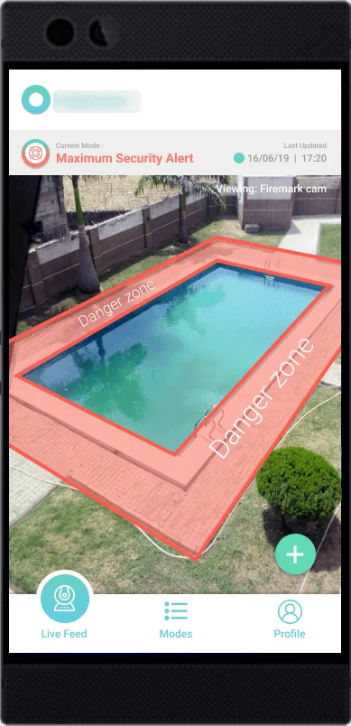
Live feed page of user's pool
This solution behaves similarly to a security surveillance camera where its main purpose is to provide a first line of prevention where users will be notified immediately upon detection of humans entering the red danger zone.
Our Challenge
App Prototype in 3 weeks
The goal was to design an App Prototype that is ‘in-synced’ with the functionality of the hardware. Since the solution was made, research was completed as well and validated by the client. We were to synthesize these findings in order to come up with a design direction.
Our objectives:
1. A simple on-boarding process
2. Easy-to-follow set up instructions
3. Clear differentiation of alerts
4. Intuitive selection of security modes
My Role
Was to build the screen to screen interactions with Figma and Protopie software tools. I worked alongside my 2 team members on the overall design direction as well.
App Walk-Through
The "Bridge" to Prevention
Despite the short timeline of the project, the final prototype was completed and achieved with two iterations where we improved three main components using ‘Protopie’ software.
Components:
1. Security Modes
2. Flow of the Onboarding Process
3. Intuitiveness of Overall Navigation
Caters to other countries and provides a proper security with the OTP verification. A welcome message for users to feel ownership.
Process is separated into two segments: Device setup and App setup. Hints are available in some of the pages to assist users.
Intuitive swipe gestures to switch between modes, with the Maximum mode as default to emphasize the importance of security. Pre-sets scenario options to save configuration time/hassle and allows tech savvy users to have an extend of control.
Personal information is placed at the top for user’s convenience to edit. Clear categorization of available features and functions.
Quick view of the live feed and a video call from the device allows users to react quickly to emergencies instead of opening the App to look at the feed.
Synthesizing
Paving the Way
With the outlook of the project in mind after the brief, some questions and uncertainties arose. We spoke to the client and managed to get a discussion with their team of data scientists.
Having a better understanding of the hardware’s available functionalities now, we were able to identify a few existing products with some similar features for references and comparisons. Along with the research data provided, personas were created to capture two major group of users.
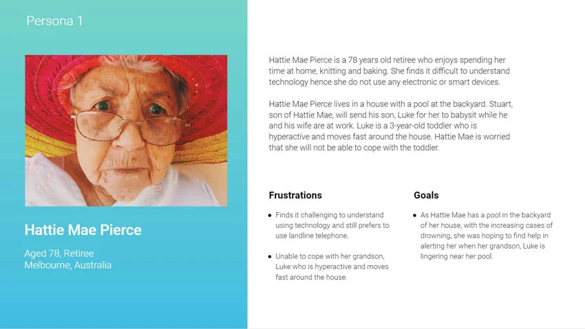
Persona 1
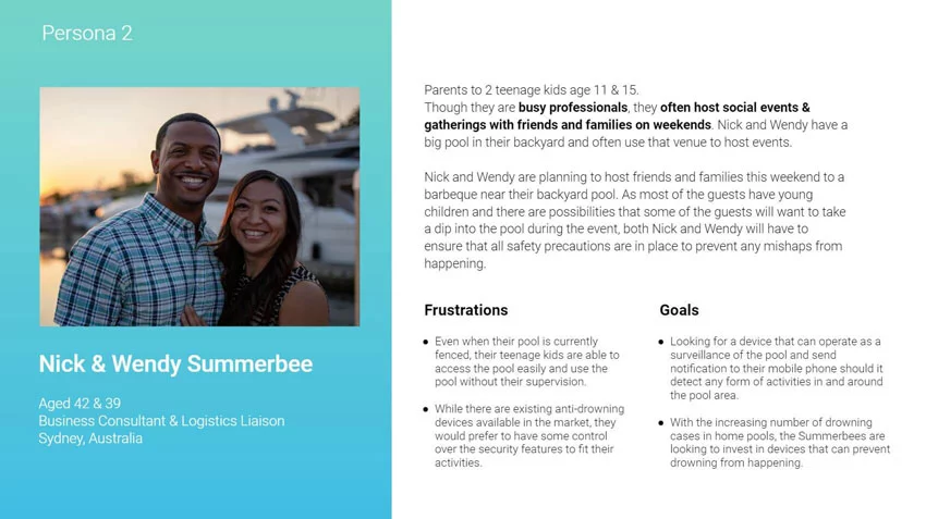
Persona 2
As the User
It was important for us to play this role in order to organize the information in the most intuitive fashion. We had to consider factors like the learning curve, clear touch points, selection confidence and product functions.
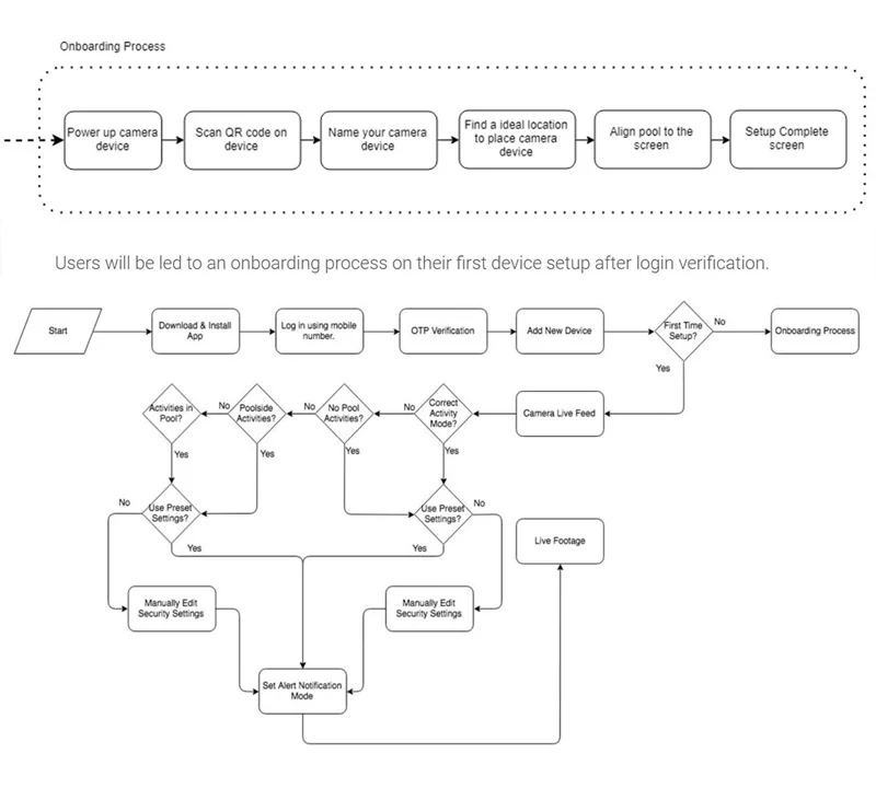
User flow diagrams
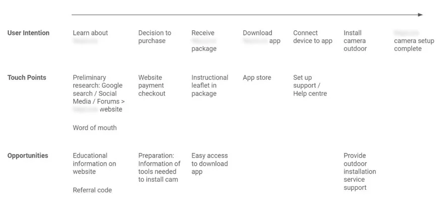
Customer Journey Map
Ideation
Building Towards the Design
We thought about how we could structure the layout and content to balance the needs of the users and our client feasibly.
The drafting process also led to questions regarding certain features or interactions were technically possible for development.
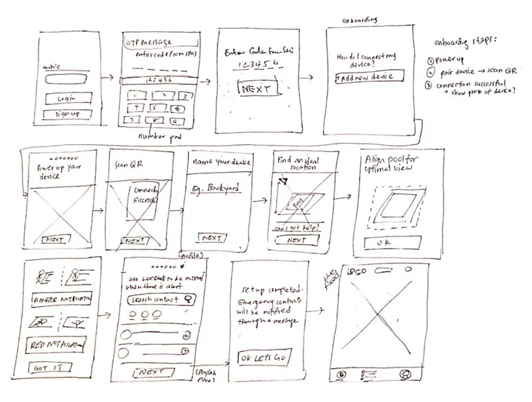
Sketches
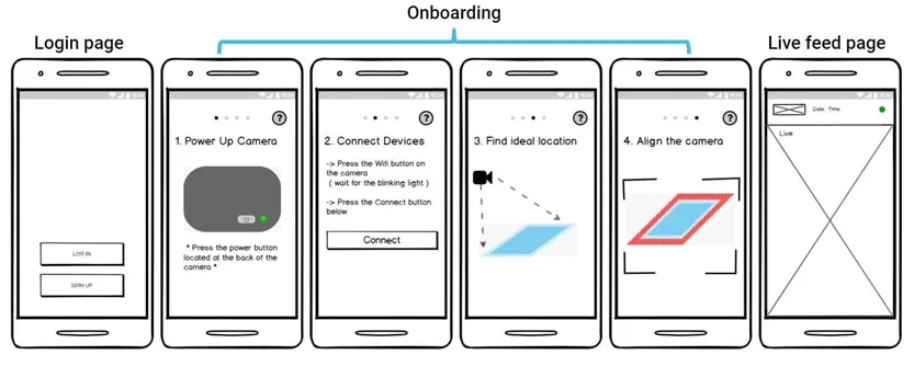
Wireframe
It was important for us to play this role in order to organize the information in the most intuitive fashion. We had to consider factors like the learning curve, clear touch points, selection confidence and product functions.
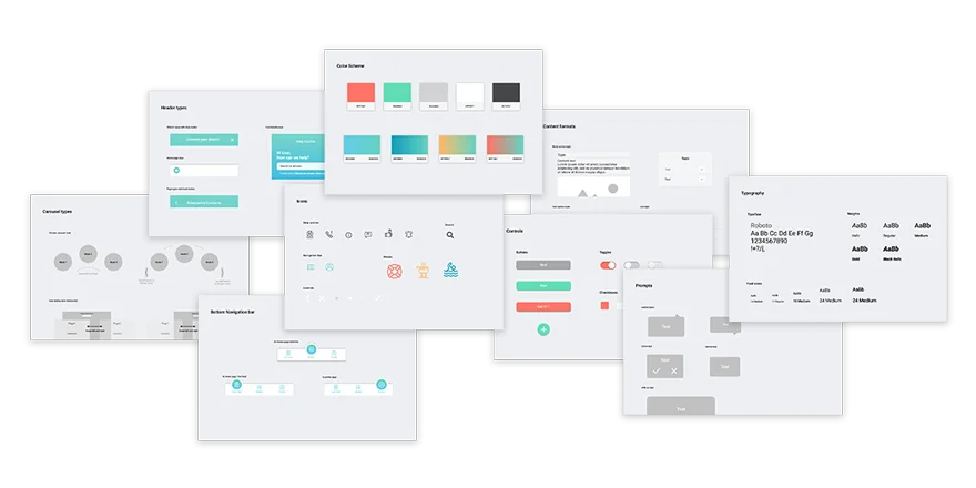
Style Guide
Prototype
Completing the Solution
By incorporating the visuals into our wireframe, our first version was tested remotely by two Australian users with a backyard pool at home.
Although we could not observe the user’s behaviours while they were attempting the scenarios provided, it was still a successful round of usability test with constructive comments.
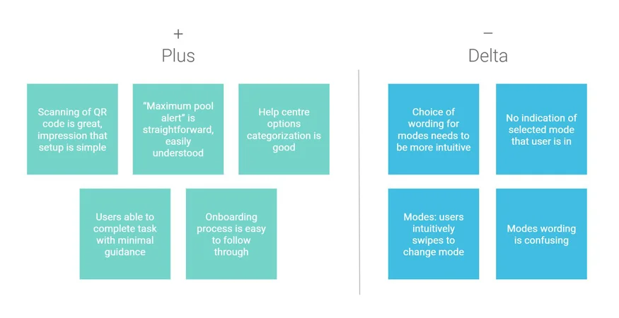
Plus-Delta diagram of the first prototype version
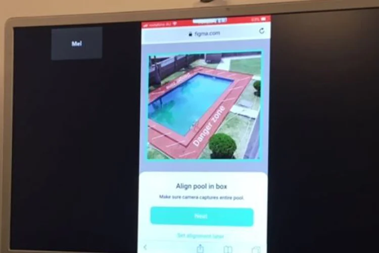
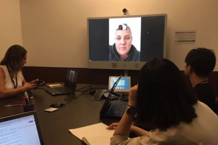
Remote Tests
The subsequent rounds of testing were completed locally with four and two participants respectively. One major finding was regarding the security modes where indications and descriptions were confusing.
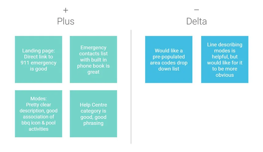
Plus-Delta diagram of the second prototype version
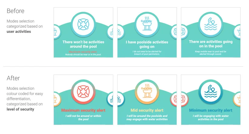
Main adjustments to the security modes
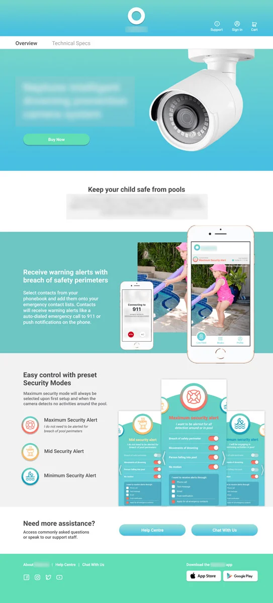
Landing page for Usability Test scenarios
The Next Steps
More Iterations
There are so much more to just designing the visuals and every opportunity allows growth. Hopping into the midst of a solution is a very valuable experience, as the process of taking over and understanding the project can be very challenging.
While the feedback from the participants were mostly positive, the prototype can still be further iterated.
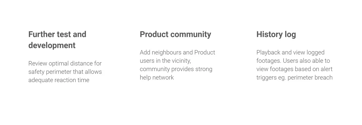
Suggestions for future improvements
In conclusion, this was a successful project, our clients were very satisfied with the result and would like to push this design for development to proceed with the live test of their product.
